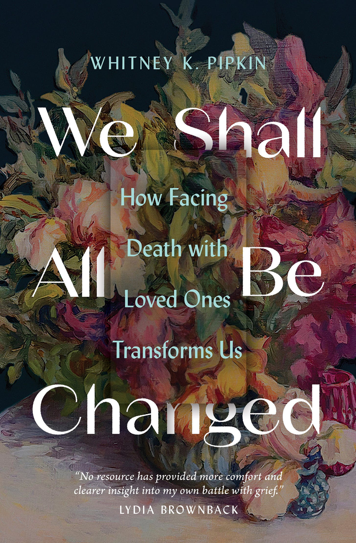
I am thrilled to share the cover for my forthcoming book, We Shall All Be Changed: How Facing Death with Loved Ones Transforms Us. The team at Moody Publishers did a beautiful job on this cover, and I’m so grateful.
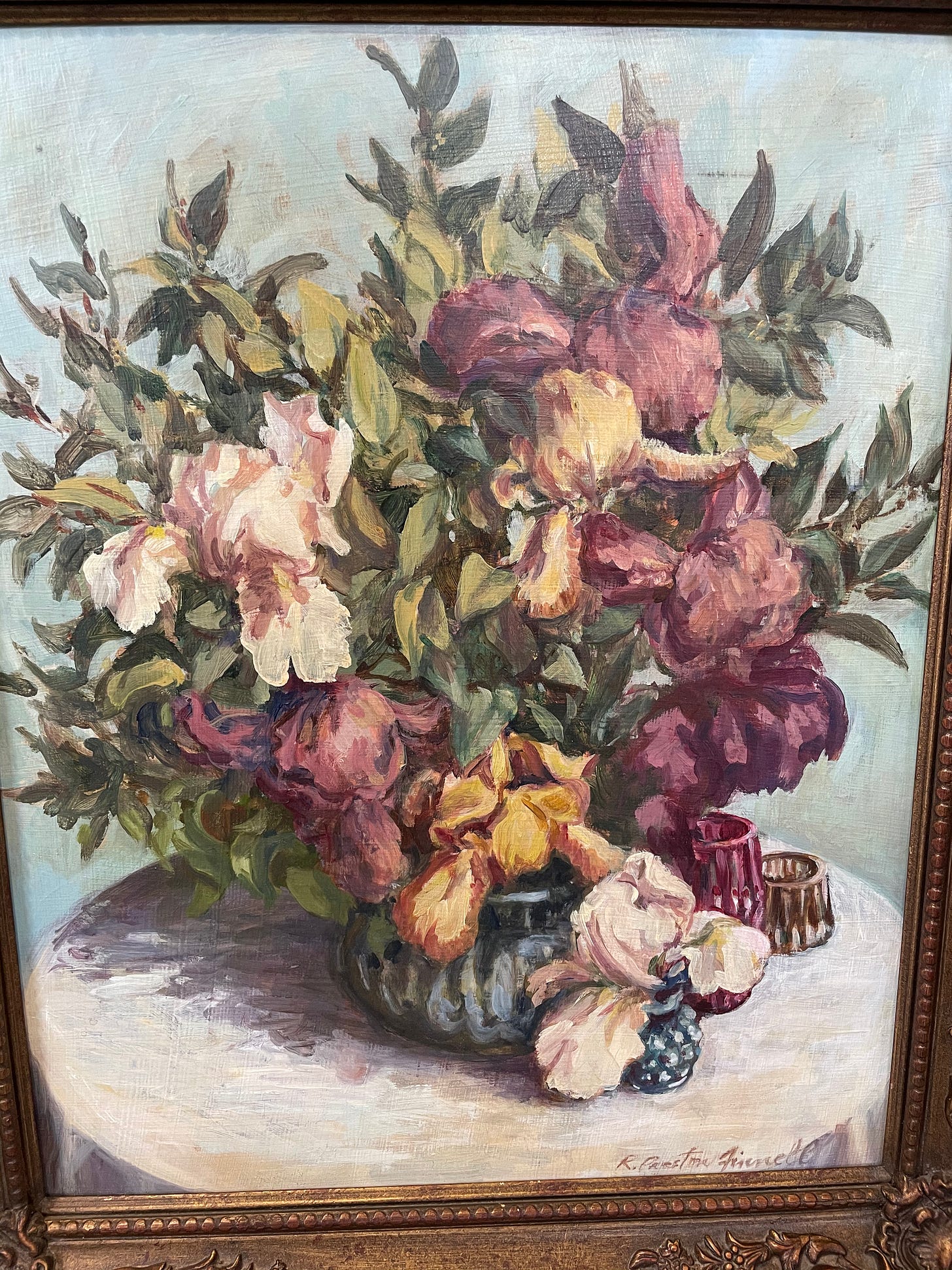
A little backstory: I don’t know if the art director at Moody was prepared for how many ideas and opinions I’d throw at him about a book cover. I sent a Dropbox folder and a Pinterest board. I said I was imagining something like those dark-backdropped Dutch floral paintings that are achingly gorgeous and moody. And I also included a photo of one of my favorite pieces of art in the entire world, a floral painting by my grandmother that now hangs in my bedroom.
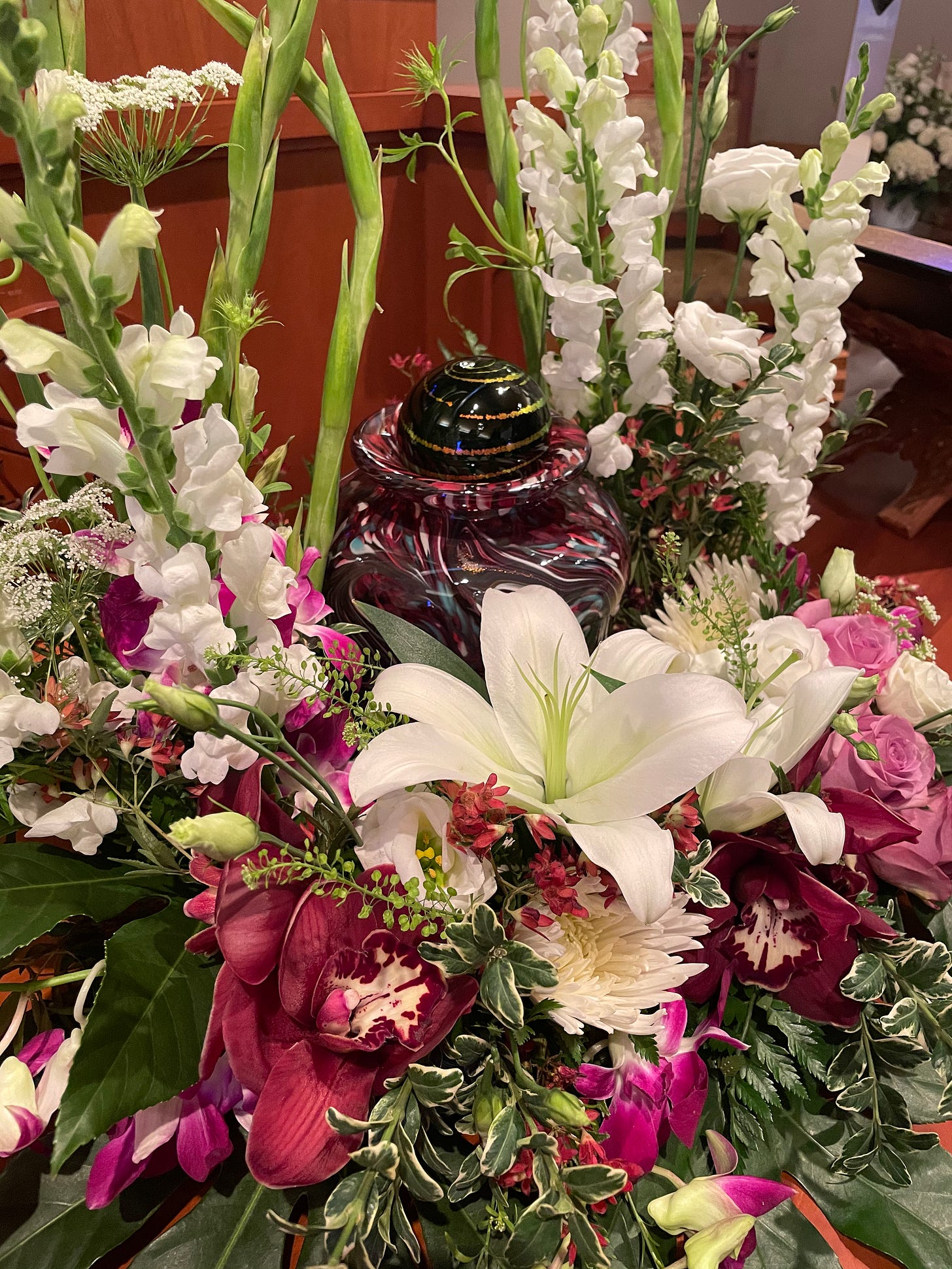
This painting had been one of my mom’s favorites too, filled with shades of maroon and hunter green (hello 90’s décor of my youth), but also blues and highlights of pink and green. After she died, we took this painting to the Karg Art Glass studio in Wichita and asked the team there to design a blown-glass urn inspired by it.
As I type this, I realize how utterly sentimental I have gotten, how much I relish the layers of meaning in this story. I grew up watching them blow glass at the Karg studio, usually with my Granny on the other side of my family. I remember the smell of molten glass, the feel of hot flames on my face and the sheer wonder of watching the glass art take shape.
All that to say, the painting was already meaningful to me when I included it in my inspiration folder for the book cover.
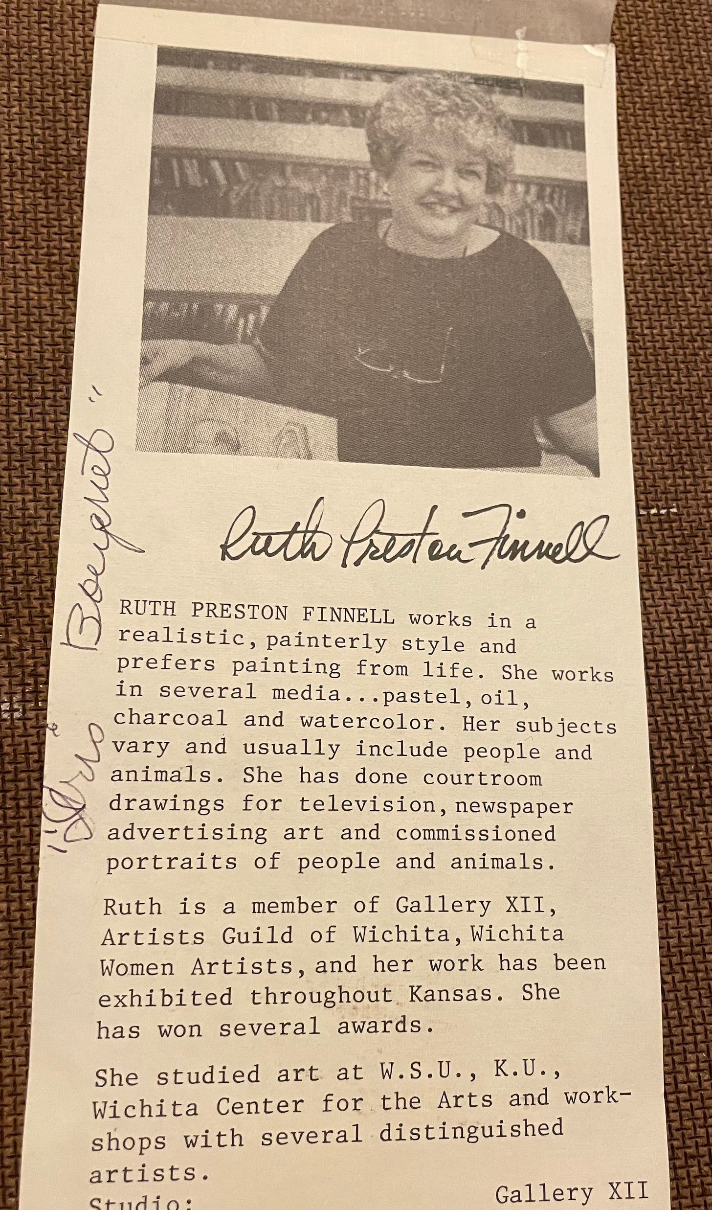
The art director worked with freelance designers to send me four very different cover designs, all of which I liked, two of which I really loved. But only one of them featured — much to my surprise — the painting by my grandma, Ruth Ann (Preston) Finnell, as the backdrop to the book’s title.
As you can see, the original painting features multi-colored irises and greenery spilling out of glass vases, haphazardly, the way I like flowers to be. It originally featured a light blue background, but I love it with the dark, Dutch-inspired one for the cover.
The more I look at the cover design, the more I also appreciate the added layers and textures, the way the main title and subtitle play hide-and-seek with one another around a text box at the center. There’s just this depth to it that keeps drawing me in. It’s different, and I love it. I can’t wait to hold this cover in my hands to stare at it some more, to see the texture up close. And I think it’s the sort of cover that will make the reader want to do the same.
Most of all, I pray this cover gently invites the reader to engage with what can be a hard topic. The image makes me think of a floral arrangement from a funeral, brought home afterward and sitting in a borrowed vase on the kitchen table. It makes me think of a reader who, having recently faced a new diagnosis or loss, thinks, “What do I do now?”
This is the book for that moment and for all the moments surrounding it. I pray this cover and the words within invite readers to sit at this table and receive the beauty and comfort of Christ. Whether they’ve faced death with loved ones already or simply know that they will one day soon, I pray this book will minister to them.
Like an overflowing vase of yard-gathered irises, rich with meaning.


What a beautiful cover! I just preordered your book and look forward to reading it.
Whitney!!! This is so special and beautiful. Our God is in the details. Thank you for sharing!